Module 4: MATH AND DATA ANALYSIS
Learning Objectives
After reading this lesson, you should be able to:
plot polynomial interpolation and regression models,
plot spline interpolation models.
How can I plot the results of curve fitting?
In Lesson 4.7, we covered how to perform some curve fitting methods on discrete data using MATLAB. In this lesson, we further explore the application of curve fitting methods by looking at how they can be visualized using MATLAB.
To plot any function, we need to find its value across the domain we want to plot. To do this for a curve fitting example, the programmer needs a model that fits the given data pairs, a vector (domain) to plot the model on (query values), and a vector of predicted values corresponding to the desired domain of the plot.
From the last lesson, we know that we can use polyval() for both
polynomial interpolation and regression models to find their values at
given values of x. Example 1 shows how to plot polynomial models that
are found using polyfit(). This process does not require any new
functions or syntax; although, there are a few things to watch out for
when completing this process on your own. Be careful to clearly identify
the given values from the predicted ones. Likewise, always make sure
that you are correctly choosing and referencing the x query values for
plotting.
Example 1
Fit a fifth-order polynomial regression model to the data pairs given in Table A, and plot the resulting model and the given data pairs on one plot. Include a title, axis labels, and legend.
Table A: The data pairs used in Example 1.
| x | 0 | 1 | 2 | 3 | 4 | 5 | 6 | 7 | 8 |
| y | 1.00 | 0.540 | -0.416 | -0.990 | -0.654 | 0.284 | 0.960 | 0.754 | -0.146 |
Solution
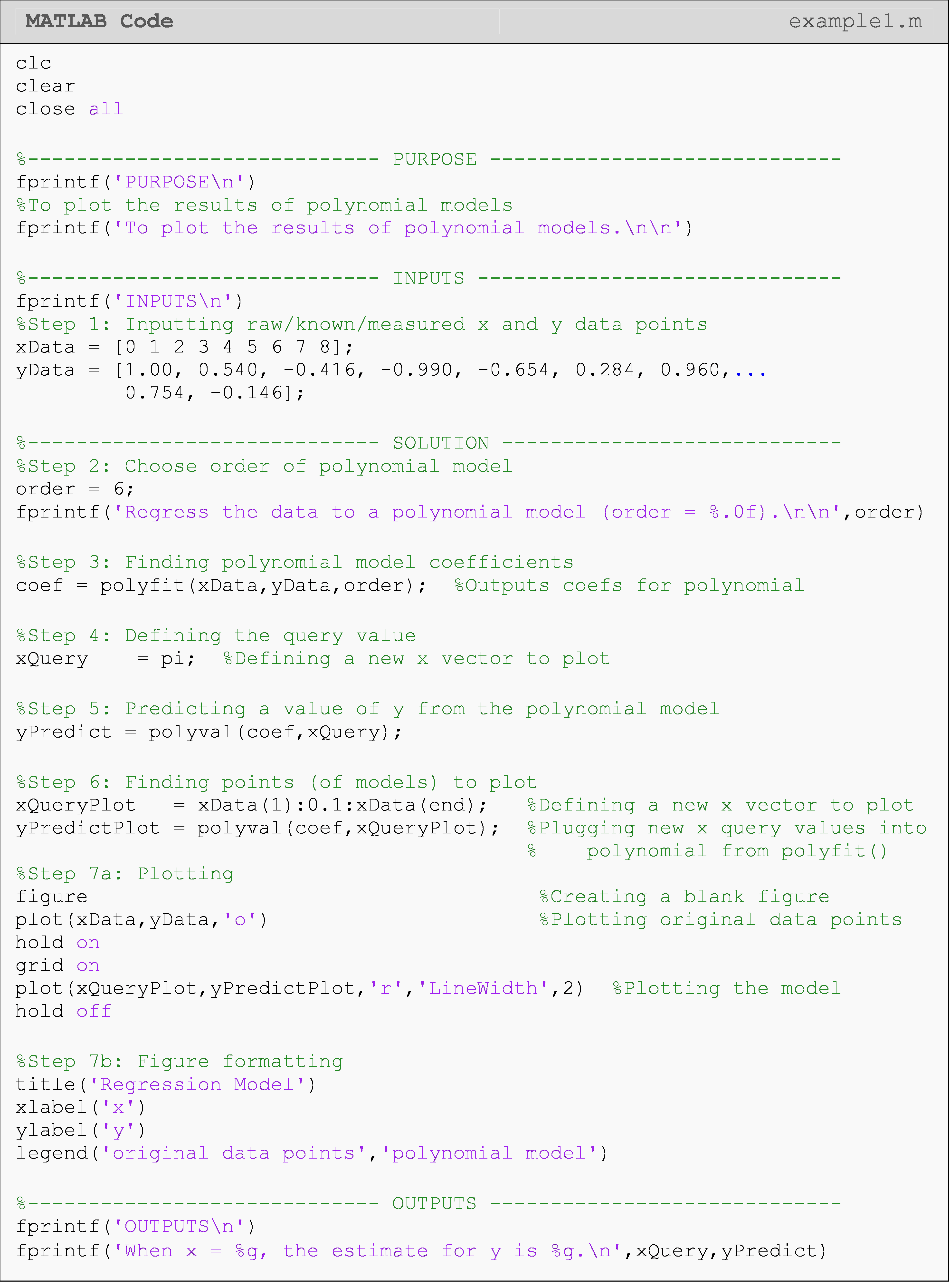
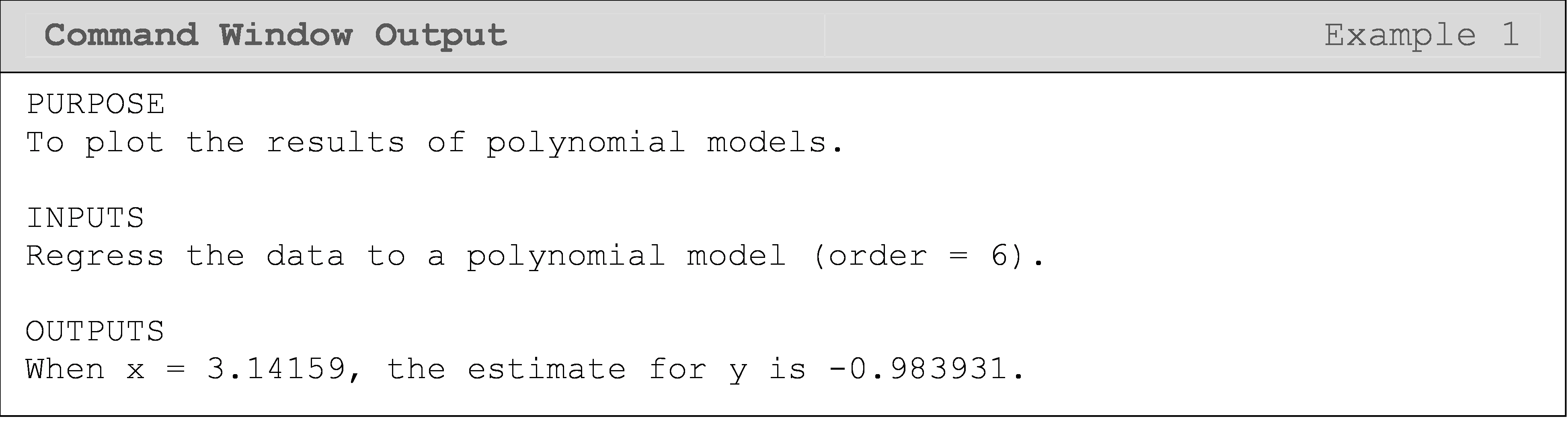
Figure 1: Figure output for Example 1 showing the plot of a regression model.
The raw y data points in Example 1 were generated from \(f(x)=\cos(x)\),
so the exact answer for yEstimate would be cos(pi)=-1. We can see
that our estimate is relatively close when comparing the discrete values
at cos(pi) (-1 vs. -0.973) and the original data points compared to
the regression model we found (Figure 1). Note that we would not know
the function \(f(x)=\cos(x)\) in a real world scenario. If we did, there
would be no reason to use curve fitting methods to find it!
In Example 2, we show an example of plotting spline interpolation
models. This requires less steps than plotting the polynomial models,
but the basics are the same. interp1() returns a vector of values
corresponding to the query points, so we can plot the results directly
without any further substitution needed.
Example 2
Fit linear and cubic-spline interpolation models to the data pairs given in Table B, and plot the resulting models and the given data pairs on one plot for comparison. Include a title, axis labels, and legend.
Table B: The data pairs used in Example 2.
| x | 0 | 1 | 2 | 3 | 4 | 5 | 6 | 7 | 8 |
| y | 1.00 | 0.540 | -0.416 | -0.990 | -0.654 | 0.284 | 0.960 | 0.754 | -0.146 |
Solution
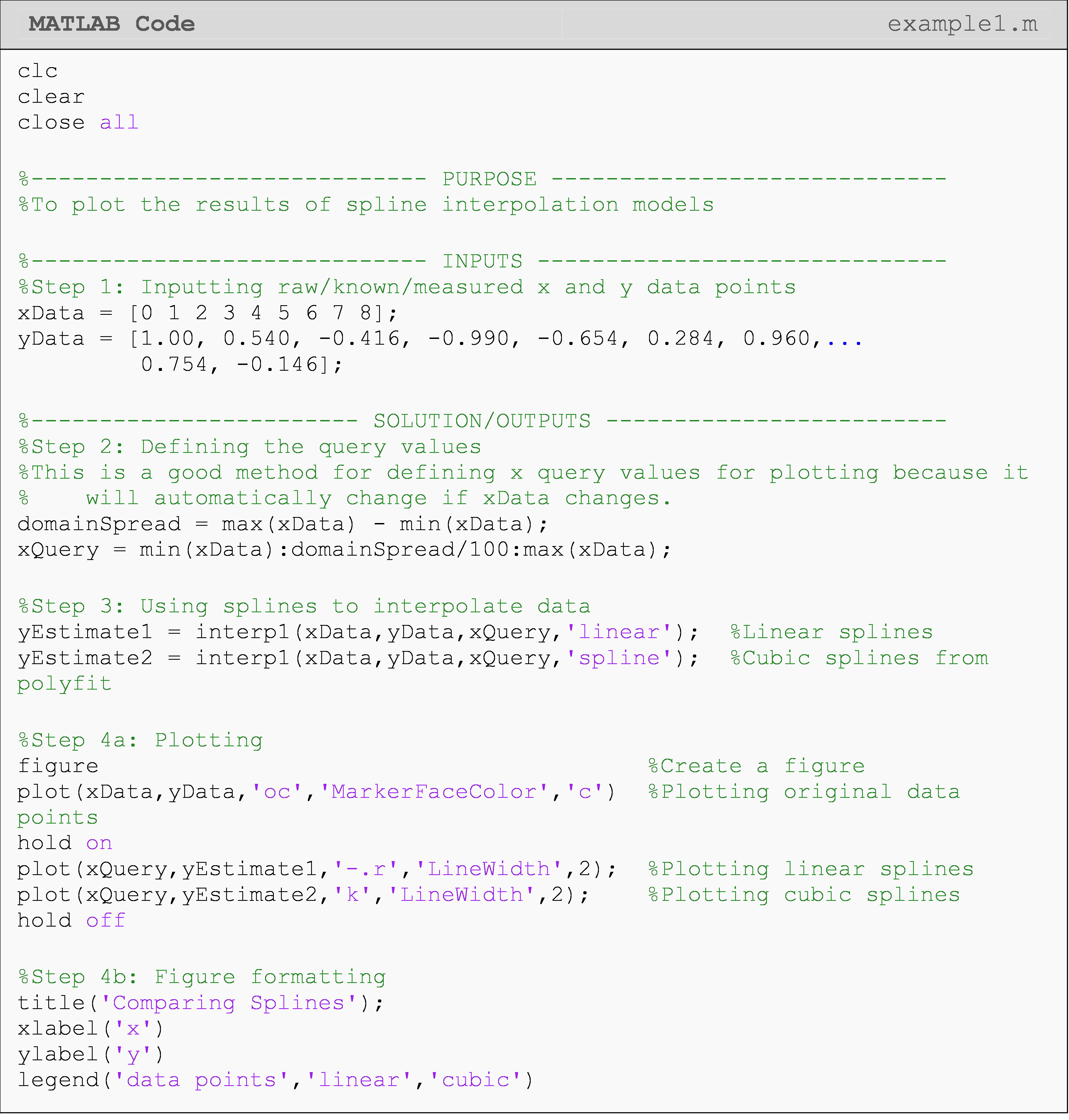
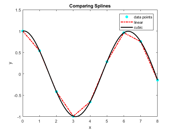
Figure 2: Figure output for Example 2 comparing linear and cubic spline interpolation results.
What are some common mistakes when plotting curve fitting results?
Some common mistakes made when first learning to perform curve fitting and plotting the results are:
(1) Plotting the coefficients of a polynomial (the direct output from
polyfit())
(2) Using the given x values as the x query values
(3) Plotting the given x values vs. the predicted y values
(4) Using the wrong function: polyfit(), polyval(), interp1()
To elaborate on the mistakes listed above, plotting the coefficients of a polynomial is incorrect as this is not a prediction: it is just part of a polynomial model. One must substitute x query values into that polynomial to get the predictions to plot.
Using the given x values as the x query values is incorrect because the whole purpose of curve fitting is to find out more information than we already know. Therefore, we should choose x query values for which we do not already know the corresponding y values.
Plotting the given x values vs. the predicted y values is wrong because it is mathematically false. If we predict the value of \(y(2.5)\) with our model, we cannot then automatically say that \(y(2.5)=y(1)\), which is exactly what is happening when you plot predicted y values against an incorrect x domain. Another symptom of this same problem is when MATLAB returns an error for the plotted x and y vectors being unequal lengths. This error cannot occur if you properly calculated and selected your x query and y predicted values. So, that is where you should start looking if this error occurs when plotting predicted values.
Finally, keep in mind that we have covered only three functions to do
all of the different interpolation and regression methods. Those
functions are polyfit(), polyval(), and interp1(). polyfit() and
polyval() pertain to polynomial interpolation and regression. For
spline interpolation (both linear and cubic-splines), use interp1().
Multiple Choice Quiz
(1). To plot a polynomial regression or interpolation model, one does not need to use the function
(a) polyfit()
(b) polyval()
(c) plot()
(d) interp1()
(2). The default output of interp1() is/are
(a) polynomial model coefficients
(b) predicted values corresponding to the provided x query values
(c) a polynomial model in symbolic form
(d) none of the above
(3). Complete the code to prepare the plot of the interpolation model.
(a) coef = polyfit(x,y,n);yy = polyval(xx,coef);
(b) coef = polyfit(x,y,n);yy = polyval(coef,xx);
(c) coef = polyfit(y,x,n);yy = polyval(xx,coef);
(d) coef = polyfit(y,x,n);yy = polyval(coef,xx);
(4). The output of polyfit() is/are
(a) polynomial model coefficients
(b) predicted values corresponding to the provided x query values
(c) a polynomial model in symbolic form
(d) none of the above
(5). The most appropriate plotting call for visualizing a curve fitting
result (where xGiven = given x values, xPredict = predicted x
values, yGiven = given y values, yPredict = predicted y values) is
(a) plot(xGiven,yPredict)
(b) plot(xQuery,yGiven)
(c) plot(xQuery,yPredict)
(d) plot(xGiven,yGiven)
Problem Set
(1). A curve needs to be fit through the seven points given in Table A to fabricate the cam. The geometry of a cam is given in Figure A.
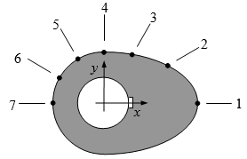
Figure A: Schematic of the cam profile
Each point on the cam shown in Figure A is measured from the center of the input shaft. Table A shows the x and y measurement (inches) of each point on the camshaft.
Table A: Geometry of the cam corresponding to Figure A.
| Point | x (in) | y (in) |
|---|---|---|
| 1 | 2.20 | 0.00 |
| 2 | 1.28 | 0.88 |
| 3 | 0.66 | 1.14 |
| 4 | 0.00 | 1.20 |
| 5 | -0.60 | 1.04 |
| 6 | -1.04 | 0.60 |
| 7 | -1.20 | 0.00 |
Using MATLAB, output a smooth curve that passes through all seven data points of the cam. Plot this model (with a black line) and the given data points (with cyan circles) on the same plot. Include a title, axis labels, and legend.
(2). A vegetable processing company has finished their first prototype of a new carrot cutting tool, and needs your help with the analysis. The device (shown in Figure B) consists of razor blade attached to a spring loaded hinged arm. The arm is free to rotate about the hinge from \(0^\circ\) to \(180^\circ\), as shown. The spring is fully loaded when the arm is at the \(0^\circ\) mark and has a neutral position at the \(180^\circ\) mark of the arm.
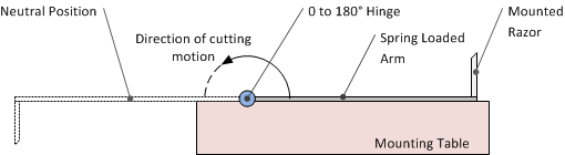
diagram112e_springloadedcutting
Figure B: Cutting device for Exercise 4.
In a laboratory, the force exerted on the far end of the arm is measured at several angles as the arm rotates about the hinge. The results are recorded in Table B.
Table B: Measured force at a given angle.
| Angle (\(^\circ\)) | 0.0 | 20.5 | 70.1 | 160.5 | 180.0 |
| Force (lbs) | 12.20 | 10.56 | 7.65 | 2.01 | 0.00 |
If the arm (C) measures 8.75 inches from the hinge to the razor, plot the torque (ft-lbs) exerted by the spring as the arm swings from the fully-loaded to fully- neutral position (use a cubic-spline interpolation model). Also, predict the value of the torque once the arm has swung \(90^\circ\).
Hint: \(\text{Torque} = \text{Force} \times \text{Arm\ length}\text{.}\) Be aware of the units.
(3). To maximize a catch of bass in a lake, it is suggested to throw the line to the depth of the thermocline. The characteristic feature of the thermocline is the sudden change in temperature. We are given the temperature vs. depth data for a lake in the table below (Table C).
Table C: Water Temperature at a given depth.
| Temperature, \(T \ ({^\circ C})\) | Depth, \(z \ (m)\) |
|---|---|
| 19.1 | 0 |
| 19.1 | -1 |
| 19.0 | -2 |
| 18.8 | -3 |
| 18.7 | -4 |
| 18.3 | -5 |
| 18.2 | -6 |
| 17.6 | -7 |
| 11.7 | -8 |
| 9.9 | -9 |
| 9.1 | -10 |
Conduct polynomial and cubic spline interpolation on the data, and plot the two interpolants. From the plot, can you judge where the sudden change in temperature is taking place?
(4). Using MATLAB, regress the following (x, y) data pairs (Table D) to a linear polynomial and predict the value of y when \(x= 55,20, - 10.\)
Table D: Data pairs (x, y) for Exercise 1.
| x | y |
|---|---|
| 325 | 2.60 |
| 265 | 3.80 |
| 185 | 4.80 |
| 105 | 5.00 |
| 25 | 5.72 |
| -55 | 6.40 |
| -70 | 7.00 |
Use the fprintf() and/or the disp() functions to output the
regression model results to the Command Window. Plot the regression
model with data points (given and predicted) on a (x, y) linear
plot.
(5). To find contraction of a steel cylinder, one needs to regress the thermal expansion coefficient data to temperature. The data is given below in Table E.
Table E: The thermal expansion coefficient at given temperatures
| Temperature, \(T \ (^\circ F)\) | Coefficient of thermal expansion, \(\alpha(\text{in/in}\text{/}^{\circ}F)\) |
|---|---|
| 80 | \[6.47 \times 10^{- 6}\] |
| 40 | \[6.24 \times 10^{- 6}\] |
| -40 | \[5.72 \times 10^{- 6}\] |
| -120 | \[5.09 \times 10^{- 6}\] |
| -200 | \[4.30 \times 10^{- 6}\] |
| -280 | \[3.33 \times 10^{- 6}\] |
| -340 | \[2.45 \times 10^{- 6}\] |
Fit the above data to \(\alpha = a_0+a_1T+a_2T^2\). Plot the regression model along with the given data points on one plot. Include a grid, axis labels, and a legend.