Module 3: PLOTTING
Learning Objectives
add axis labels to MATLAB plots,
add a legend to MATLAB plots,
add a title to MATLAB plots,
add special characters to text in MATLAB plots,
improve the overall look of MATLAB plots.
How can my MATLAB graph look nicer?
As you can tell from Lesson 3.1, developing graphs can prove to be important for interpreting data. The ability to make those graphs easier to read and aesthetically pleasing is equally important. In this lesson, you will learn several techniques to make a MATLAB plot more readable and easier to follow. This section will cover the functions and commands on how to make a legend, title, axis labels, and place a grid onto a plot. Also covered are the use of special fonts and characters and how to change the axis markings.
What are some terms I should know for plots?
Figure 1 shows the MATLAB naming convention for plotting. Most of the nomenclature is common sense and similar to other software, but it is important to know to understand how to change the different properties.
In this lesson, we will cover the two most commonly used groups of properties that define how plotted graphics look in MATLAB. Those are as follows:
Line Properties define chart line appearance and behavior: for example, the line style and thickness.
Axis Properties define axes appearance and behavior: for example, axis limits, title, and legend.
The properties are not mandatory as you could see from the last lesson. In other words, you could make a plot without MATLAB requiring you to have a title, line width, axis labels, etc.
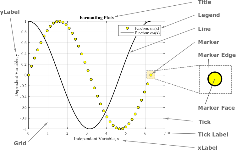
Figure 1: A MATLAB plot with common plot properties annotated.
How can I change the color and style of lines and markers on a plot?
MATLAB provides many different options to change how your plots look. You can see some of the common options in Tables 1, 2, and 3 below. Example 1 uses some of these options to customize how a figure appears.
Table 1: Various marker plotting styles.
| Desired Style | Syntax | Example Usage |
|---|---|---|
| Circle | 'o' |
plot(x,y,'o') |
| Square | 's' |
plot(x,y,'s') |
| Asterisk | '*' |
plot(x,y,'*') |
| Cross | '+' |
plot(x,y,'+') |
| Small point | '.' |
plot(x,y,'.') |
| Diamond | 'd' |
plot(x,y,'d') |
| Five-pointed star | 'p' |
plot(x,y,'p') |
Table 2 shows different line styles used to represent the function in
the generated plot. To change the color of a line or data point, use the
parameters given in Table 3. Note that these color and line style
options can be used in the same parameter input to the plot()
function. For example, we can instruct MATLAB to make the plot a dotted
red line with plot(x,y,'r:').
Table 2: Various line plotting styles.
| Desired Line Style | Syntax | Example Usage |
|---|---|---|
| solid line (default) | '-' |
plot(x,y,'-') |
| dashed line | '–' |
plot(x,y,'–') |
| dotted line | ':' |
plot(x,y,':') |
| dash-dot line | '-.' |
plot(x,y,'-.') |
Table 3: Various color options for data points and lines.
| Desired Color | Syntax | Example Usage |
|---|---|---|
| blue (default) | 'b' |
plot(x,y,'b') |
| red | 'r' |
plot(x,y,'r') |
| black | 'k' |
plot(x,y,'k') |
| yellow | 'y' |
plot(x,y,'y') |
| magenta | 'm' |
plot(x,y,'m') |
| green | 'g' |
plot(x,y,'g') |
| cyan | 'c' |
plot(x,y,'c') |
How can I make the function and points on the graph look nicer?
There are many ways to display the desired function(s) and/or data
points on a graph. To name a few, modifications include the change of
the following - color, size, shape, line type, and outline of both the
points and function. Typing doc plot in the Command Window will yield
tables of information and codes that can be used to modify your graph.
Line Parameter: Line width of a curve (function)
'LineWidth'
Parameter Value:
Any positive integer – the larger the number the thicker the line
width
Example Usage:
plot(x,y,'LineWidth',2) (read more about code placement below)
Line Parameter: Size of a data point symbol
'MarkerSize'
Parameter Value:
Any positive integer – the larger the number the larger the marker
size
Example Usage:
plot(x,y,'MarkerSize',6) (read more about code placement below)
Both the LineWidth and MarkerSize parameters must be used in
conjunction with the plot() function as they are parameters of this
function; therefore, they must go inside the plot() function. To
illustrate this, Example 1 shows both the m-file and generated figure
using these parameters.
Example 1
Plot the function \(y=2.1x+4.4\) and the following data set on the same plot. Data pairs to plot are: (0, 4.12), (2, 8.6), (4, 11.5), (5, 15.3), (7, 18.0), (8.5, 21.25). Plot the function within the domain of 0 to 10 with an interval between the points of 0.1. Use blue points (markers) for the data set with a specified marker size of 6 and a red dotted line for the function with a line width of 2. Include a legend, title, and axis labels on the plot. Use bold font for the title and italicize the axis labels.
Solution
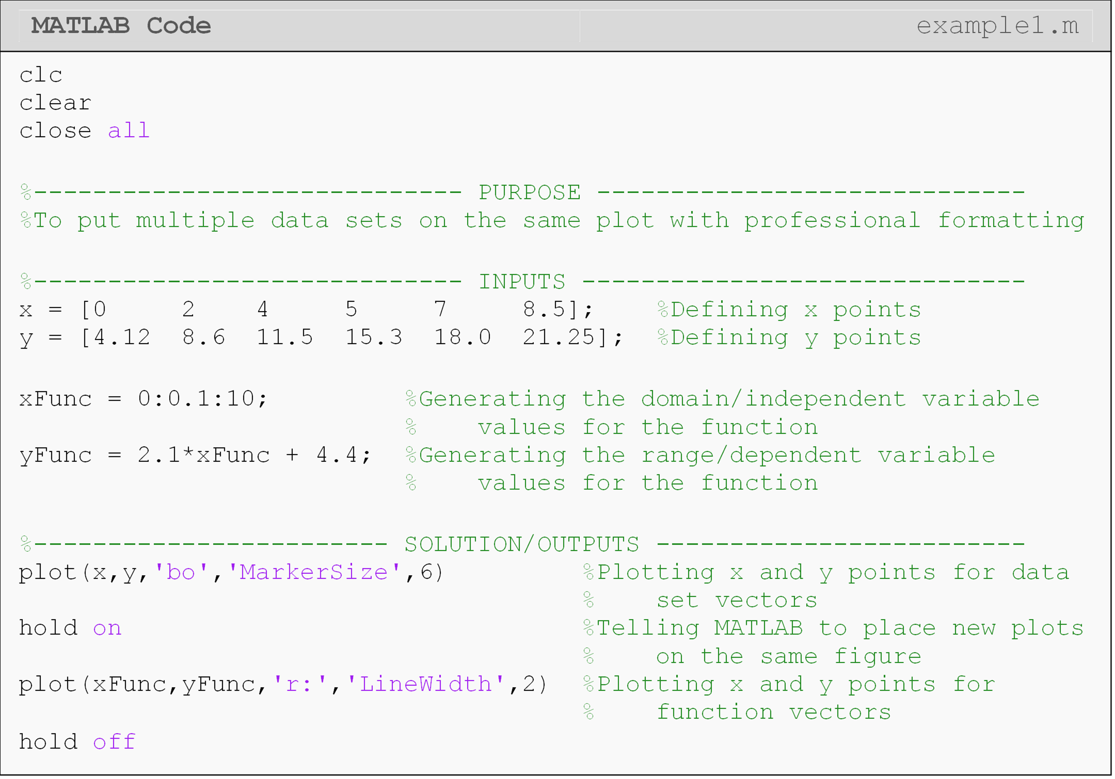
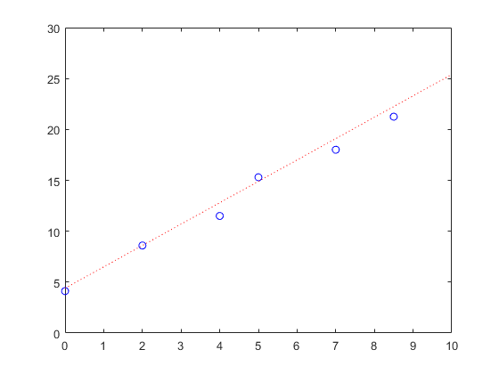
Figure 2: The figure output by the code in Example 1.
How can I put a title and axis labels on my plot?
Whenever you are making a plot, you should always use a title and axis labels. Even if it is the world’s simplest plot, these things are important. MATLAB contains several preprogrammed functions that allow the user to add a figure title and axis labels to a graph.
Example 2 shows an m-file with the corresponding figure using the
title(),xlabel(), and ylabel() functions.
How can I add a legend to my plot?
The function to add a legend to a plot is legend(). In the m-file, the
legend() function must be placed after the last plotting call. The
order in which the descriptions should appear in the legend is the
same as the order in which the functions/points are plotted. When making
a legend, double-check that the descriptions match with what MATLAB is
plotting. MATLAB will automatically place the line style of the
function/point with the description provided by the user for each object
in the legend.
Example 2 shows an example m-file of how to use a legend in a
MATLAB-generated figure. Notice the use of the 'location' parameter to
manually set the location of the legend on the plot. The parameter ‘NW’
(northwest), which must directly follow it, specifies where we want the
legend to by on our plot. The locations are given as cardinal
directions: north, south, east, west, etc.
Note in the m-file in Example 2, the placement of the LineWidth and
MarkerSize parameters inside the plot() function. Also, note the
placement of the title(), xlabel(), ylabel(), and legend()
functions, which are after the plot() function in the m-file.
How can I add a grid to my graph?
Using a grid in a figure is a helpful tool to make a graph more
readable. However, using a grid is not always useful. In some cases, a
grid can be counter-productive because the grid lines can crowd a plot.
Placing a grid is very similar to using a title or axis label, just type
grid on. Just like hold off, you can also use grid off.
Example 2
Plot the function \(y=2.1x+4.4\) and the following data set on the same plot. Data pairs to plot are: (0, 4.12), (2, 8.6), (4, 11.5), (5, 15.3), (7, 18.0), (8.5, 21.25). Plot the function in the domain of 0 to 10 with an interval between the points of 0.1. Use blue points (markers) for the data set with a specified marker size of 6 and a red dotted line for the function with a line width of 2. Include a legend, title, and axis labels on the plot. Make the title in bold font and axis labels in italics.
Solution
Note: This is an extension of the solution given in Example 1.
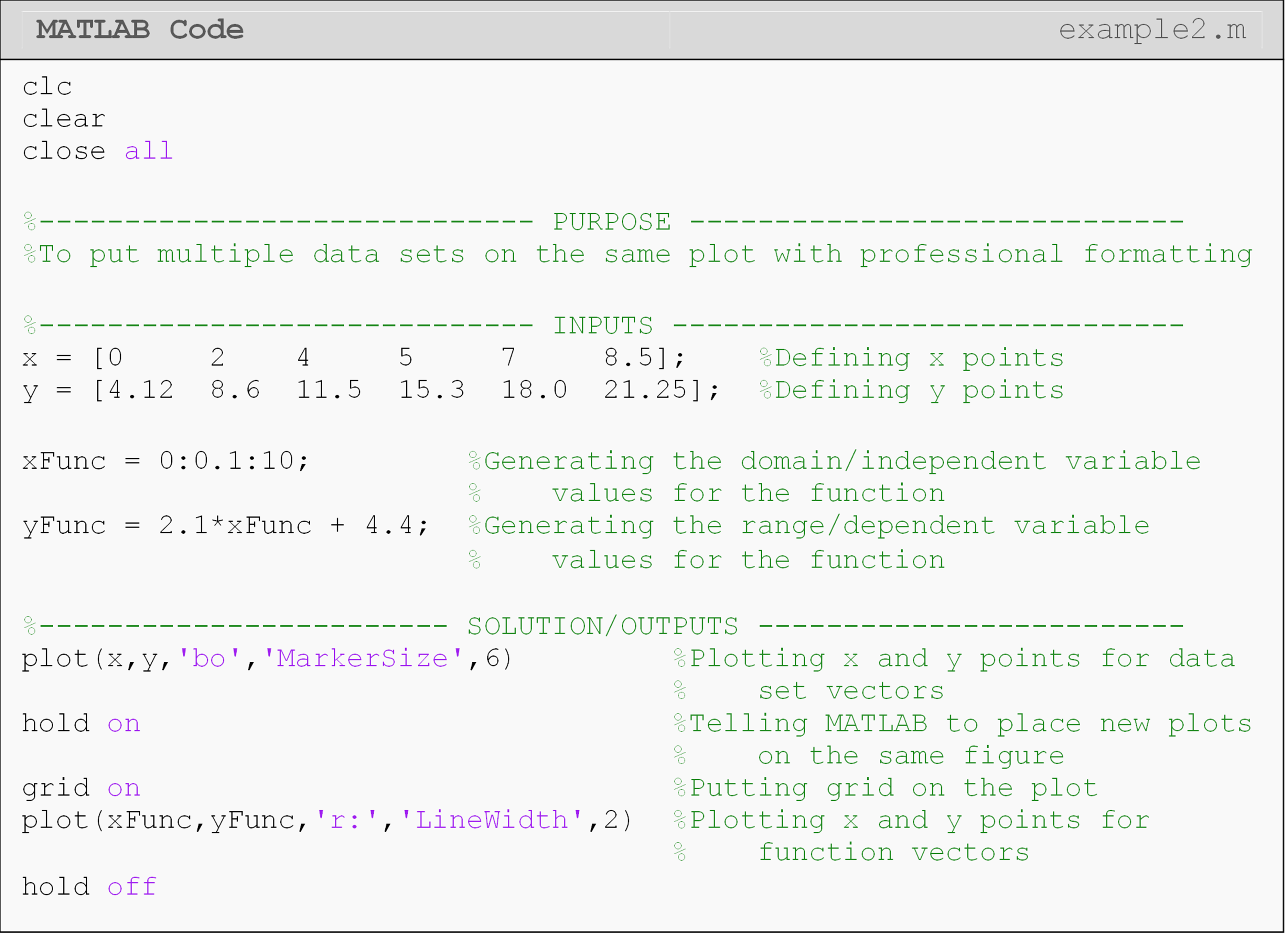
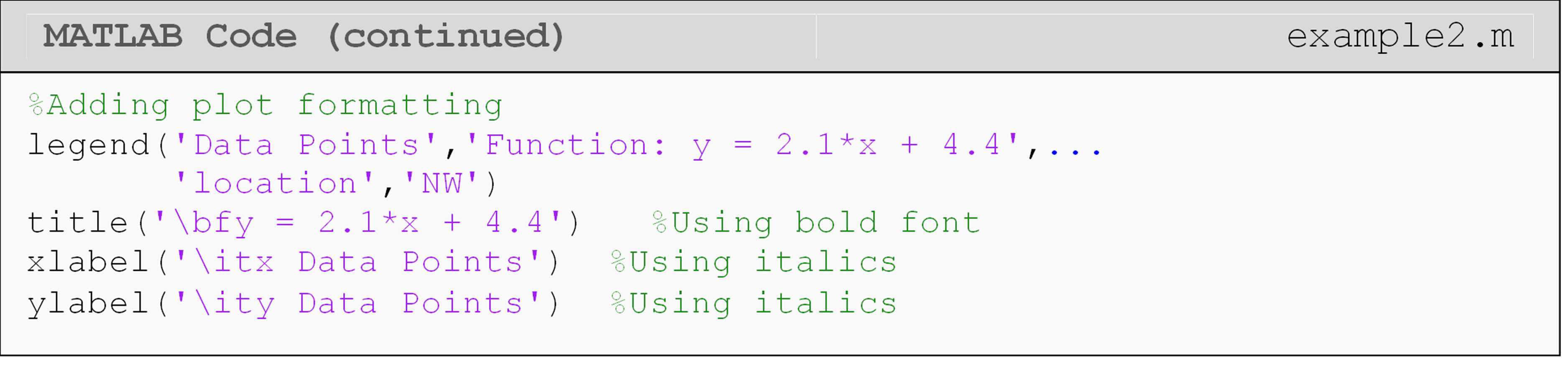
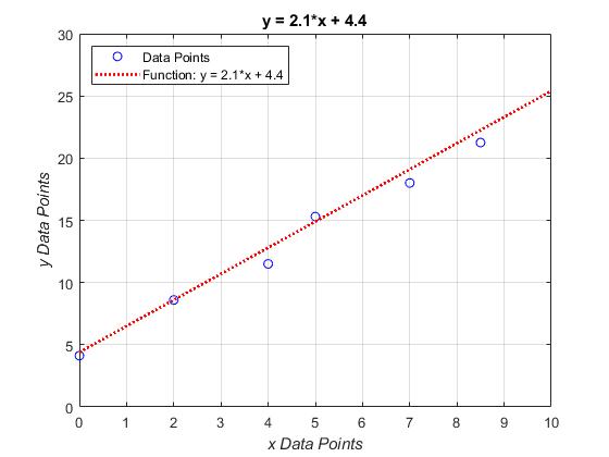
Figure 3: The figure output by the code in Example 2.
Similar to the title or axis label functions, the grid command needs
to be placed after the plot() function in m-file. If hold on is
used, the grid command should be directly after it as shown in Example
2.
How can I add special characters in my axis labels and title?
It may be necessary to add superscripts and subscripts to the item
description(s) to the plot title, legend and/or labels. The syntax for
superscripts and subscripts are placed where needed in the title(),
xlabel(), ylabel(), and legend() functions. What is to be placed
in the desired superscript or subscript must be inside braces {}, and
the script character is placed before the braces. The character _ is
used for subscripts and the character ^ is used for superscripts.
Similarly, one may use similar script statements as shown below for the
axis labels, legends, etc. For example, to display,
\(\displaystyle y_1=x^3\) in the title of a figure, one would type:
plot(x,y)
title('y_{1}= x^{3}')
The use of Greek letters or bold, italic and regular font may also be
useful when making a graph. These can be added using a backslash
followed by the desired font variation. To name a few, add bold font by
using \bf, italic font by using \it, and regular font by using \rm
followed by the desired text. To display Greek letters, one can use
\greek_letter (see Table 4 and Example 3).
Table 4: Some of the special characters to be used with figures. The symbols can be used with any of the functions given as examples and more.
| Symbol | Syntax | Example Usage |
|---|---|---|
| \(\alpha\) | \alpha |
title('\alpha') |
| \(\omega\) | \theta |
xlabel('\theta') |
| \(\pi\) | \pi |
ylabel('\pi') |
| \(\sigma\) | \sigma |
legend('\sigma') |
| \(\tau\) | \tau |
xlabel('\tau') |
| \(\pm\) | \pm |
ylabel('\pm') |
| \(\div\) | \div |
legend('\div') |
For example, to place, \(\mathbf{c=2^*\pi^*r}\) in the title of a figure
(notice the bold font), one would type title('\bfc = 2*\pi*r'). For a
more complete list of special characters that can be used with your
figures, conduct a MATLAB help search (keyword: Text Properties).
Example 2 shows the use of a few special font styles, including bold
font and subscripts in a plot.
How can I change axis limits and tick labels?
MATLAB makes it easy to adjust the limits of your axes to fit your data.
The xlim()
function adjusts the displayed domain of the horizontal axis, while the
ylim() function
adjusts the displayed range of the vertical axis.
For some data, such as the sinusoidal wave shown in Example 3, it can be
useful to change the tick increments.
xticks()
and yticks()
redefine the tick increment. That is, how far apart the ticks are on the
axis. The corresponding tick labels can be changed with the
xticklabels()
and
yticklabels()
functions. These will allow you to change the tick label to any custom
text compatible with MATLAB.
Example 3
Plot the function \(f(t)=0.3\sin(t)\) for time values of 0 to \(2\pi\) in steps of 0.2. Set the x-axis ticks and tick labels to be from \(0\) to \(2\pi\) in steps of \(\pi/2\). Be sure to use the symbol (\(\pi\)) rather than just writing “pi”.
Solution
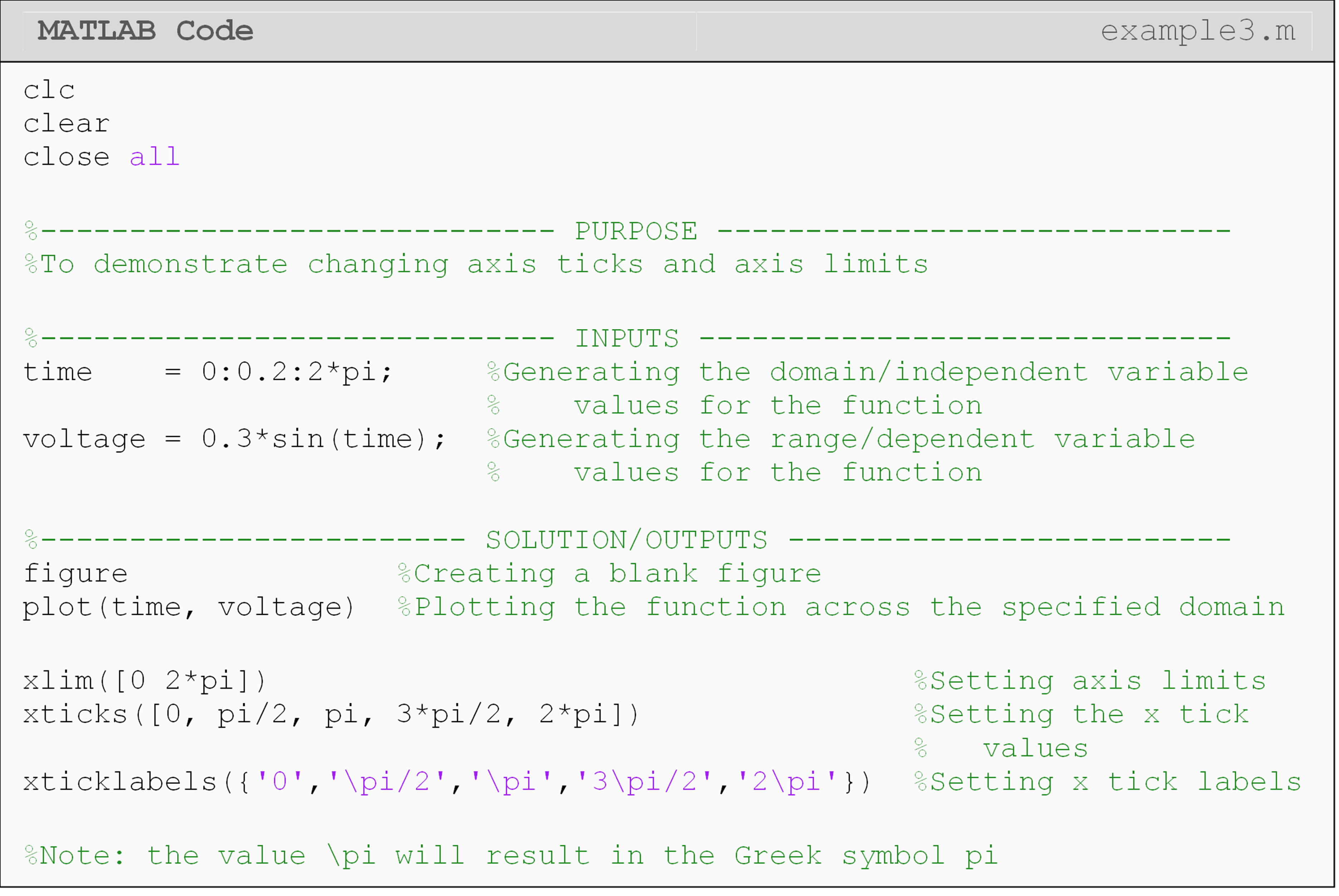
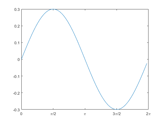
Figure 4: Plot with custom axis limits and axis labels on the horizontal axis (output for Example 3).
Lesson Summary of New Syntax and Programming Tools
| Task | Syntax | Example Usage |
|---|---|---|
| Add a title to plot | title() |
title('Your title') |
| Add x-axis label to plot | xlabel() |
xlabel('Your x label') |
| Add y-axis label to plot | ylabel() |
ylabel('Your y label') |
| Place a legend on the plot | legend() |
legend('plot1','plot2') |
| Place a grid on the plot | grid |
grid on |
| Set custom line width for a data set | LineWidth |
plot(x,y,'LineWidth',5) |
| Set a custom marker size for a data set | MarkerSize |
plot(x,y,'MarkerSize',5) |
| Set custom x limit for plot | xlim() |
xlim([lowerX,upperX]) |
| Set custom y limit for plot | ylim() |
ylim([lowerY,upperY]) |
| Set custom x ticks for plot | xticks() |
xticks([minTick,maxTick]) |
| Set custom y ticks for plot | yticks() |
yticks([minTick,maxTick]) |
| Set custom x tick labels for plot | xticklabels() |
xticklabels({'x1','x2'}) |
| Set custom y tick labels for plot | yticklabels() |
yticklabels({'y1','y2'}) |
Multiple Choice Quiz
(1). The function to add a title to a plot is
(a) ptitle()
(b) t()
(c) title()
(d) label()
(2). The MarkerSize parameter
(a) adjusts the overall size of the figure font.
(b) adjusts the size of plotted points.
(c) changes the aspect ratio of the graph size.
(d) changes the thickness of plotted lines.
(3). To add a subscript, use the character(s)
(a) n{}
(b) n()
(c) _{}
(d) _()
(4). Which of the following will show the plot title in italics?
(a) title('\it This is a plot title.')
(b) title('it{This is a plot title.}')
(c) title('it(This is a plot title.)')
(d) title('This is a plot title.\it')
(5). Two sets of data points and a function, coded in the order,
data_set_1, data_set_2, and function_1, are plotted. The correct
code sequence to create the appropriate legend is
(a) legend('data set 1','data set 2','function 1')
(b) legend('function 1','data set 2','data set 1')
(c) legend(data set 1, data set 2, function 1)
(d) Code sequence does not matter.
Problem Set
(1). A rocket is horizontally strapped to the top of a sled and ignited. The position of this contraption is given as a function of time t (sec) by
\[\displaystyle s(t)=\frac{3}{50}t^3+\frac{7}{30}t^2-5t\ \ \text{(ft).}\]
Plot the position of the sled in MATLAB from 0 to 60 seconds. Add a title (bold font) and axis labels (italic font) to the plot. Remember to follow the guidelines given in Lesson 3.1 for raising a vector to a power when plotting.
(2). Plot the lift and drag forces exerted on an airfoil as a function of velocity. Use velocity (v) values from 0 to 45 m/s on a log-linear plot (log-scale on the y-axis). The working fluid density (\(\rho\)) is 1.423 kg/m3, the exposed airfoil area (A) is 129 m2, and the coefficients of drag (\(C_D\)) and lift (\(C_L\)) are 0.178 and 0.896, respectively. Recall that the equations for drag and lift forces are
\[F_D=\frac{1}{2}C_D\ A\ \rho\ V^2,\]
\[F_L=\frac{1}{2}C_L\ A\ \rho\ V^2,\]
Your plot should display an appropriate legend, title, axis labels, and units. The line width of the two lines should be adequately sized. Remember to follow the guidelines given in Lesson 3.1 for raising a vector to a power when plotting.
(3). The required specific input work (kJ/kg) for an insulated refrigerant compressor is found to be,
\[w_{in} = h_{out} - h_{in}\]
where \(h_{out}\) and \(h_{in}\) have units of kJ/kg and correspond to the enthalpies at the exit and inlet of the compressor, respectively. The inlet enthalpy is given as a constant value of 278.76 kJ/kg. On the other hand, exit enthalpy will change as a function of exit pressure and temperature. The following data is collected:
\[\displaystyle \text{Exit pressure (bar)} = \left [1.0\ \ 1.4\ \ 1.8\ \ 2.0\ \ 2.4\ \ 2.8\ \ 3.2\right]\]
\[\displaystyle h_{out}\left( \frac{kJ}{kg} \right) =\left[278.76\ \ 286.96\ \ 295.45\ \ 304.50\ \ 313.49\ \ 332.60\ \ 342.21\right]\]
Plot the input work as a function of the exit pressure, and show the data as points (use circles) on a standard linear plot. Add a figure title and axis labels, use increased marker size, and show a grid.
(4). Torque, T, is given by \(T=F\cdot r\) where F is the force and r is the radius (moment arm). Create two plots on two separate figures. In one figure, plot the torque vs. radius. Use a constant value of F = 5 N and radius values of 0 to 10 m with a step size of 0.2. In the second figure, plot the force vs. radius.
Let the torque be a constant value of 5 Nm and the same radius values as the first plot. You can rearrange the torque equation to solve for force: \(\displaystyle F=\frac{T}{r}\). Include a title, axis labels, and a grid on both figures. Remember to follow the guidelines given in Lesson 3.1 for a vector in the denominator when plotting.
(5). Given the data set below for stress and strain for a uniaxial text on a unidirectional composite material, create a 2D line plot of stress vs. strain. Use a solid, green line with an appropriate line width. Also include a grid, axis labels, axis limits, and units to improve the appearance and effectiveness of your plot.
Table A: Stress vs. strain for a composite material.
| Stress (MPa) | Strain (%) |
|---|---|
| 0 | 0 |
| 306 | 0.183 |
| 612 | 0.36 |
| 917 | 0.5324 |
| 1223 | 0.702 |
| 1529 | 0.867 |
| 1835 | 1.0244 |
| 2140 | 1.1774 |
| 2446 | 1.329 |
| 2752 | 1.479 |
| 2767 | 1.5 |
| 2896 | 1.56 |