Module 3: PLOTTING
Learning Objectives
represent data in a bar graph,
create line and surface plots in three dimensions,
graph data in a polar plot.
Does MATLAB have more plotting capabilities?
In the previous lessons in this module (Lessons 3.1 and 3.2), we learned how to create and work with plots represented in two dimensions. However, sometimes you may want to show the data in a different type of plot. Although we will only cover a few of the more common advanced plotting capabilities in this lesson, MATLAB offers many other useful plotting formats. In this lesson, we cover bar graphs, 3D line and surface plots, and polar plots. This will give you a very good foundation to branch out to other options MATLAB offers if you need to do so in the future.
How can I create a bar graph?
Bar graphs are a great means to show quantities across groups. For example, a bar graph may be used to display how many students have received a certain discrete grade on an exam.
MATLAB uses the
bar()
function to create a bar graph. We demonstrate how to create a bar graph
in Example 1 as well as change some essential parameters. In the first
graph, there is a one-to-one correlation between groups and their
values. However, in the second graph, we have a row of y data for each
x data point. This results in “bar series”, which you can see in the
graph output (Figure 1).
You can review the documentation for the syntax specifics on a number of
functional and formatting options like line color (outlines, fills,
etc.), width, and style. Try to play around with the code and change the
values of each of the inputs to get a sense of what aspect of the final
output bar graph changes! One important additional thing to know is that
bar()
does not accept strings as categories directly. This means if your
categories are strings (Example 1 has numbers as categories), you will
need to use the function `categorical()` to convert your categories
(strings) into an appropriate data type. You can review the MATLAB
documentation for
bar() to
see an example of this case.
Example 1
Display the data sets given below (Data set 1 and Data set 2) with two separate bar graphs. The “groups” (horizontal axis) are “21”, “22”, “23”. Make all the bars black for data set 1, and use three different bar colors for data set 2. Put a title and axis labels on the figure for data set 2.
Data Set 1: \(\displaystyle\begin{bmatrix}\text{1.1} & \text{8.4} & \text{5.1} \\\end{bmatrix}\)
Data Set 2: \(\begin{bmatrix}\text{1.1} & \text{1.4} & \text{1.6} \\\text{8.1} & \text{8.8} & \text{8.4} \\\text{5.5} & \text{5.7} & \text{5.6} \\\end{bmatrix}\)
Solution
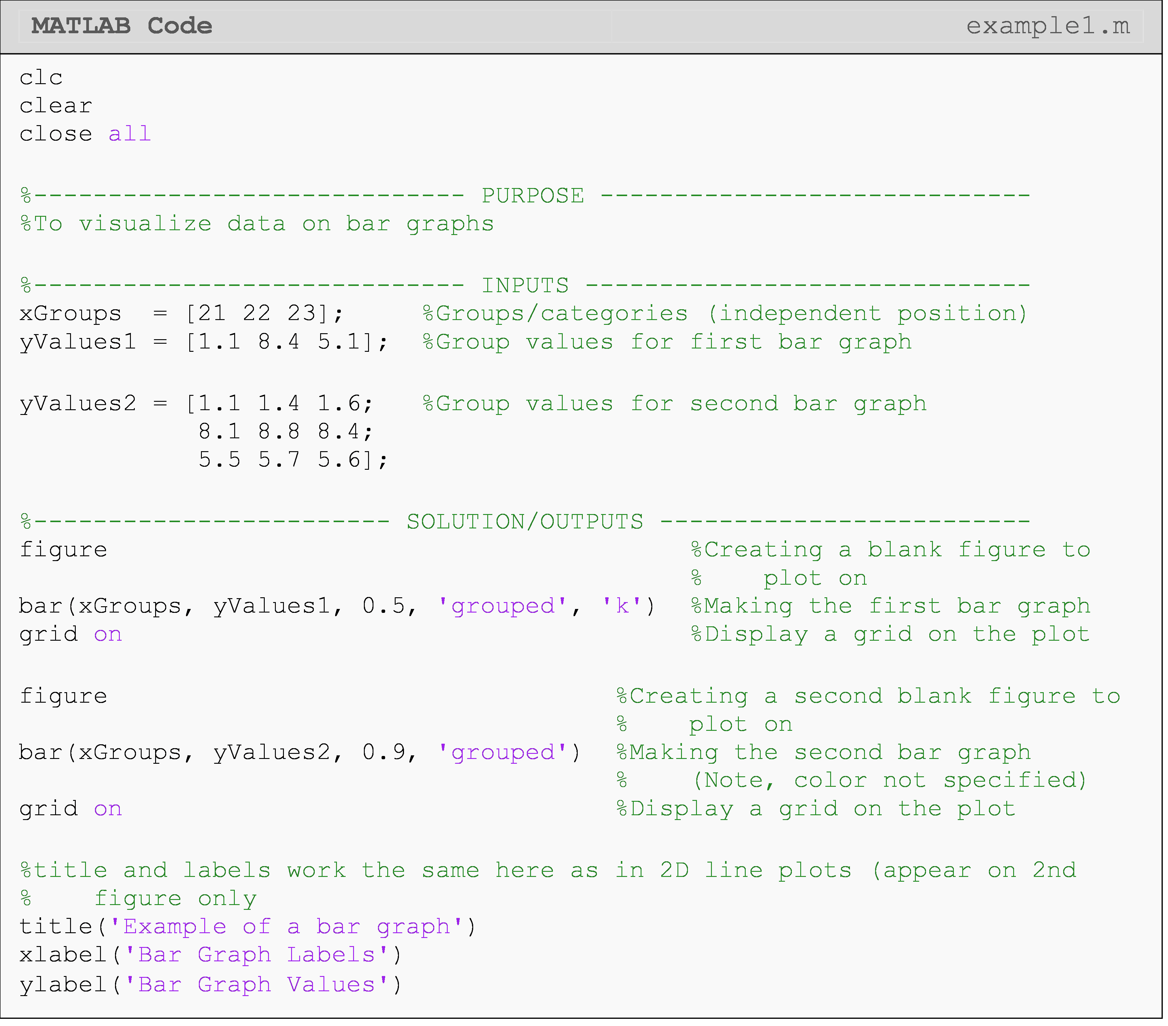
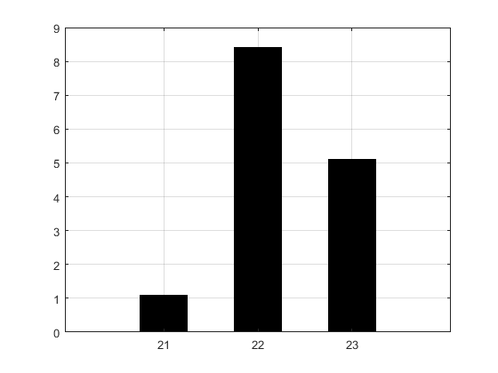
Figure 1: Figure outputs for Example 1.
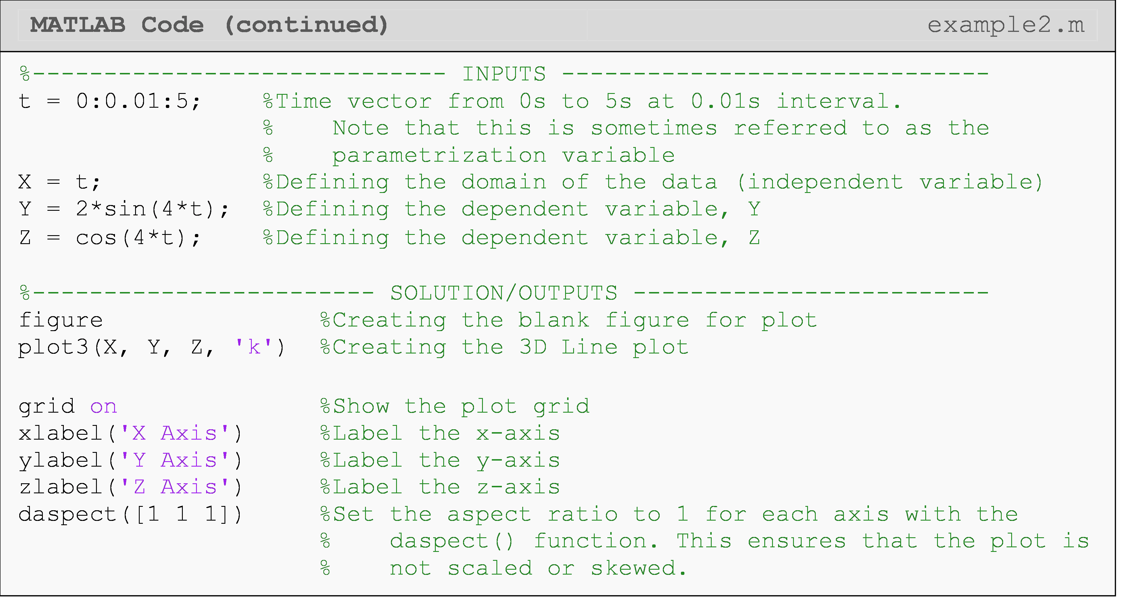
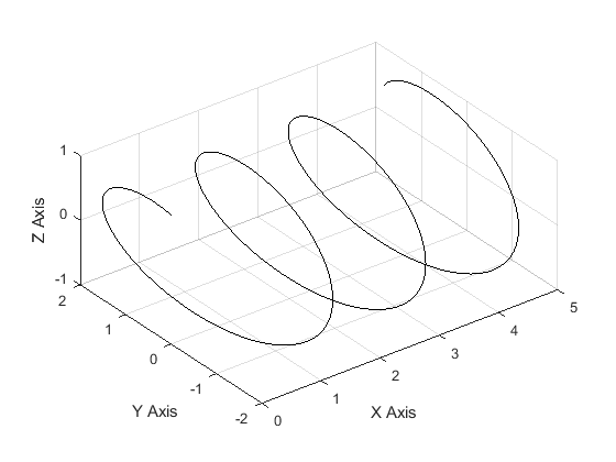
How can I create a 3D line plot?
Plotting in three dimensions can be useful when visualizing a function with two independent variables which could be over space, time, or any other changing quantity (e.g., \(z(x,y),\ y(x,t)\), etc.). For example, it may be useful to visualize the speed of a car over time and across a number of starting speeds (using \(x(t,v_i)=v_i-a\cdot t\)). To do this, MATLAB makes plotting in three dimensions very straightforward with both 3D line plots and 3D surface plots.
As the name suggests, a 3D line plot shows a line drawn across three
dimensions. A 3D line plot is generated with the
plot3()
function as seen in Example 2. Note that the
plot3()
function is just like the conventional 2D
plot()
function from previous lessons; however, it needs one additional
dependent variable parameter in the third dimension.
Sometimes, you may wish to set the aspect ratio between axes to be
1:1:1. You can do this using the daspect() function, which allows you
to adjust the ratio between all three axes.
How can I create a 3D surface plot?
Visualizing a surface in 3D requires that all surface points that we want to plot to be defined in 3D (of course). This is not as simple as giving three vectors like we did for plotting a 3D line because we now have a surface to plot. You could think of this as many lines stacked against each other. There are two main steps to getting the coordinates we need for a 3D surface. The first part of this process is to create a grid of independent coordinate points. Next, we use these 2D points to generate the third dimension, which is similar to generating a vector for a 2D function like we saw in previous lessons in this module (Lessons 3.1 and 3.2).
Fortunately, MATLAB provides the
meshgrid()
function to automate the process of creating a mesh of surface points.
We only need to give a vector input for each independent variable
(dimension), and
meshgrid()
will do the rest! Figure 3 shows an example of how
meshgrid()
creates coordinate grids (matrices) from vector inputs.
Once the two coordinate grids (X and Y) are obtained, those two
matrices are used to create a third matrix of points as shown in Figure
3. This third matrix will be plotted as the dependent variable (i.e.,
Z(X,Y)) on the 3D plot. You can see further explanation and
documentation of this process for
meshgrid()
in MATLAB documentation.
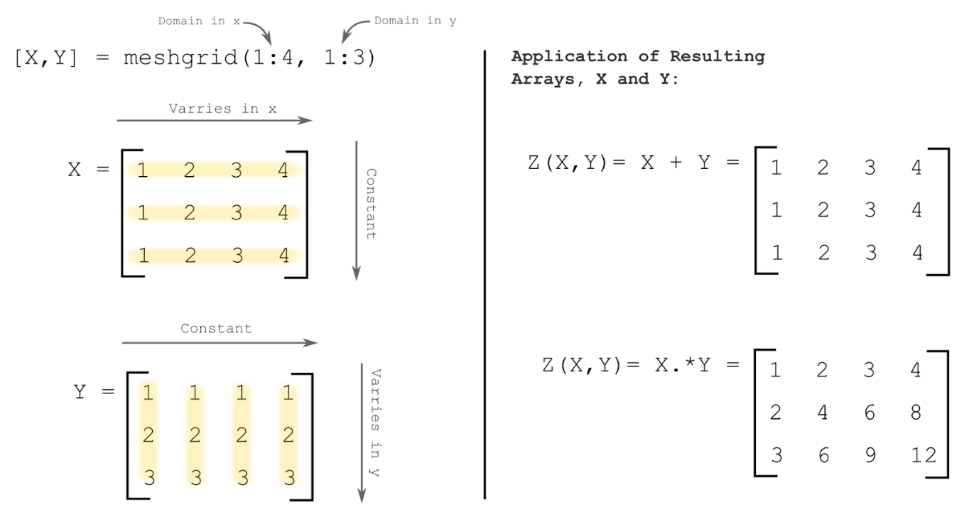
Figure 3: Visual demonstration of how
meshgrid()
generates coordinate grids, X and Y, (matrices) from range vector
inputs. The right side shows the application of these grids in order to
generate a dependent function Z(X,Y) in three dimensions.
After each of the three coordinate grid matrices is created (two
independent and one dependent), the
surf() function
can be used to plot the surface coordinates (surface defined by the
function) as shown in Example 3. Note that you can change the color
theme of the surface with the
colormap
command. The different color themes that can be used with
colormap
are given in Table 1. There are many more color theme options than we
can show here including making complete custom theme colors.
Table 1: Some common color themes for the
colormap
command to use with 3D surface plots.
| Color Theme & Syntax | Example Usage |
|---|---|
spring |
colormap spring |
summer |
colormap summer |
autumn |
colormap autumn |
winter |
colormap winter |
hot |
colormap hot |
gray |
colormap gray |
Example 3
Create a 3D surface plot of the function \(Z=\cos(X)+0.1Y+1\). Use values
from -4 to 8 for the X variable with a step size of 0.3. For variable
Y, use values from 0 to 10 with a step size of 0.5. Specify the
colormap theme ‘autumn’.
Solution
At the end of the example code, we use the function daspect(). Using
daspect() to manually set the aspect ratio for axes ensures that the
figure will not be skewed or stretched in a way that we do not want.
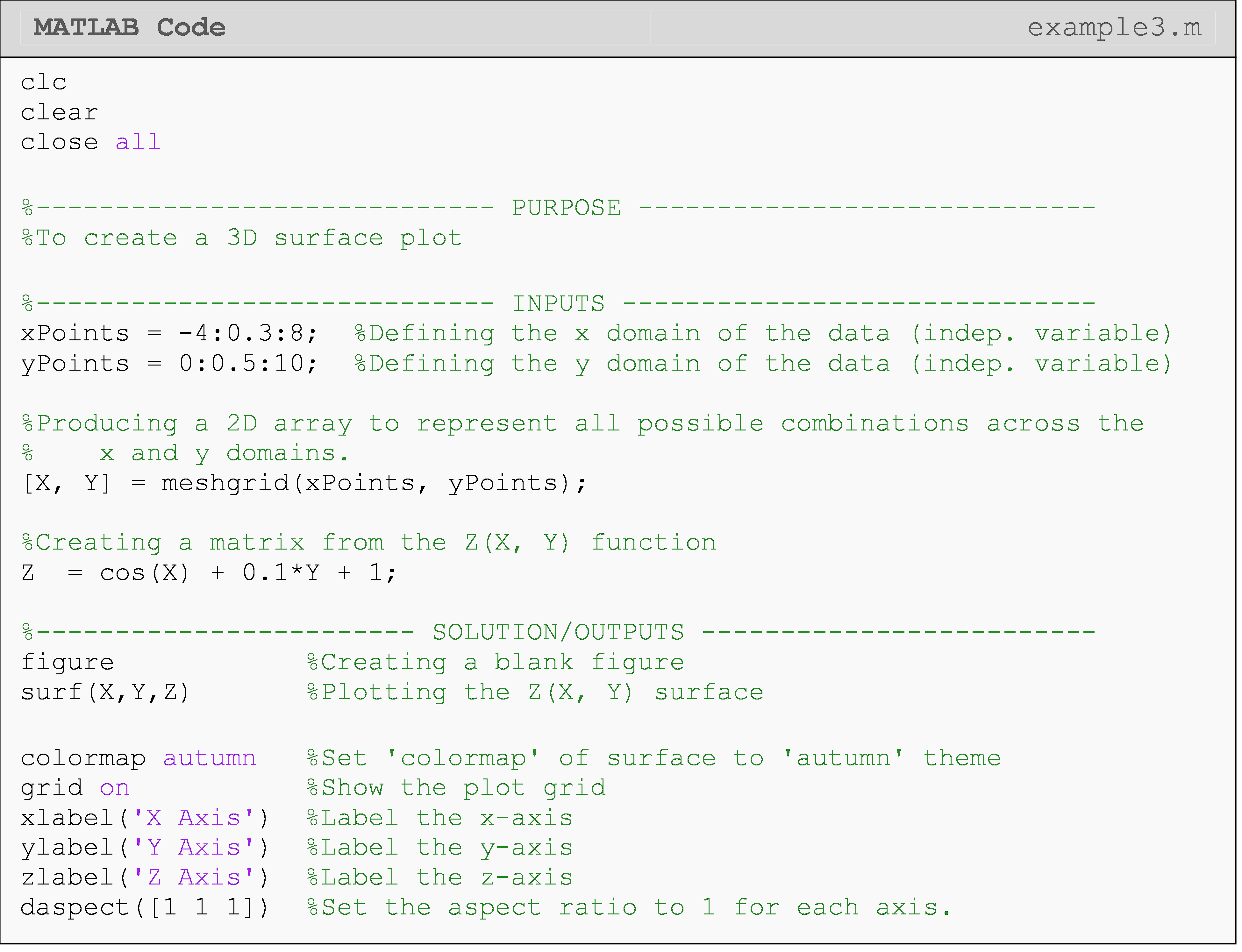
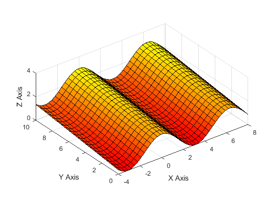
Figure 4: Figure output of a 3D surface plot for Example 3.
Similar results to Figure 4 of creating a 3D surface can be obtained by
using the
mesh() or
contour()
function instead of the
surf()
function. The
mesh() function
(not to be confused with
meshgrid())
creates a wire surface, while the
contour()
function creates a 2D contour map (similar to a heat map) of the
surface.
How can I create a polar plot?
Some data will require you to visually analyze functions in the polar (or radial) coordinate system, where data points vary around some center point. For example, the forces around a stationary wheel vary around the wheel (i.e., force is a function of angle).
We can plot such 2D polar/radial functions with the
polarplot()
function (use
polar()
for previous versions (before R2016a)), which accepts an angle vector
(independent variable in Example 1) and a radius vector (dependent
variable in Example 1). Line
properties
such as color or width can be changed in the same way used in
plot().
 Important Note: The angle vector
for
Important Note: The angle vector
for
polarplot()
must be in radians: not degrees.
Example 4
Plot the function \(r=2\cos(5\theta)\) on a polar plot. Use theta values from 0 to \(3\pi/2\) with an interval of 0.01. Set appropriate limits on the plot.
Solution
While polar plots function similar to “regular” 2D Cartesian plots,
changing specifics of the plot like the grid, labels, font, spacings,
etc. require a different set of axis properties called polar axis
properties.
For example,
ylim() is
rlim() and
yticks() is
rticks() for
polar axes. You can see an application for this in Example 4.
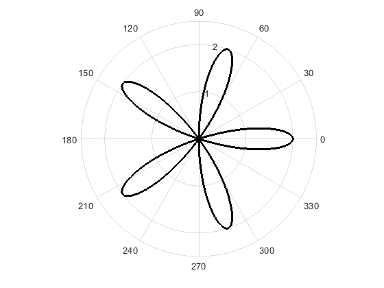
Figure 5: Figure output of a 2D polar plot for Example 4.
Lesson Summary of New Syntax and Programming Tools
| Task | Syntax | Example Usage |
| Create a bar graph | bar() |
bar(groups,values) |
Format group
names to be
used with
bar() |
categorical() |
categorical({'group1', 'group2'}) |
| Create a 3D line plot | plot3() |
plot3(x,y,z) |
| Set aspect ratio between plot axes | daspect() |
daspectdaspect([1,1,1]) |
| Creates mesh of surface points for 3D surface plot | meshgrid() |
mesh grid([1:10],[1:10]) |
| Plot surface coordinates | surf() |
surf(x,y,z) |
| Give surface a color theme | colormap |
colormap winter |
| Create a polar plot | polarplot() |
polarplot(theta,r) |
| Set custom limits on the radial axis | rlim() |
rlimrlim([rMin, rMax]) |
| Set custom limits on the angular axis | thetalim() |
thetalim([thetaMin, thetaMax]) |
| Set custom tick values for the radial axis | rticks() |
rticks({'r1','r2','r3'}) |
| Set custom tick values for the angular axis | thetaticks() |
thetaticks({'t1','t2'}) |
Multiple Choice Quiz
(1). To create a 3D line plot, the correct function and inputs are
(a) plot3(x,y,z)
(b) plot3d(x,y,z)
(c) plot(x,y,z)
(d) 3D(x,y,z)
(2). To create a 3D surface plot, the correct function is
(a) surf()
(b) contour()
(c) surfplot()
(d) surf3d()
(3). For a 3D surface plot, the inputs should be
(a) matrices
(b) vectors
(c) integers
(d) strings
(4). To place a label on the x-axis of a 3D plot, one should use
(a) xlabel()
(b) xlabel3()
(c) label1()
(d) label3d()
(5). For a 3D line plot, the inputs should be
(a) matrices
(b) vectors
(c) integers
(d) strings
Problem Set
(1). Create a bar graph of the movies that are currently in the top five for the highest domestic, opening weekend box office numbers (given below in Table A). Make the bars on the graph red and be sure to make your graph look nice. Add a title, change the y-axis tick labels to be in millions (e.g., $200 million would be “200”), and y-axis label (be sure to note the scale is in millions).
Table A: Top five box office numbers (domestic) for the opening weekend of the movie.
| Movie Title (abbreviated) | Avengers: Infinity War |
The Force Awakens |
The Last Jedi |
Jurassic World |
The Avengers |
| Opening Weekend Box Office ($) | 257,698,183 | 247,966,675 | 220,009,584 | 208,806,270 | 207,438,708 |
(2). Plot the parametric functions \(x=2t\), \(y=\cos(3t)\), \(z=\sin(2t)\) using values for t of 0 to 10 with an interval of 0.1. Use a red line with a line width of 3.
Try exploring the plot by clicking Tools>Rotate 3D from the figure window menu. Note how the plot looks if you rotate it to view only the XY or XZ planes.
(3). Plot the hyperbolic function\(f(x,y)=x^2+y^2\) using values from -3 to 3 with an interval of 0.1 for x and y. Choose a color theme that you like and put a grid on the plot. Place axis labels on all three axes. Remember to use the array operator for the exponents in this problem (Lesson 3.1).
(4). Plot the equation \(z=\ln(x^2+y^2)\) using values from -2 to 2 with an interval of 0.1 for x and y. Choose a color theme that you like and put a grid on the plot. Place axis labels on all three axes. Remember to use the array operator for the exponents in this problem (Lesson 3.1).
(5). Plot the function for theta values of 0 to 4 in steps of 0.01 using a polar plot. Change angular (theta) axis ticks and tick labels to be aligned with \(0\), \(\pi/4\), \(\pi/2\), \(3\pi/4\), etc. Be sure to use the symbol for pi.