Module 3: PLOTTING
Learning Objectives
display two-dimensional plots,
display several plots on one graph,
display logarithmic plots.
How can I visualize (plot) data in MATLAB?
Making a plot is vital for analyzing and understanding data as well as relaying information to your colleagues. Plots are commonly used in books, reports, and many other engineering documents. This lesson will cover the basic concepts of developing plots using MATLAB.
Ask yourself, “What information do I want to plot?” MATLAB has many methods for developing a plot, but we will focus on the plotting of lines in this lesson. The plot will require two vectors. One of these vectors is the horizontal (abscissa) axis values and the other vector is for the vertical (ordinate) axis values.
How do I plot data pairs (points) in MATLAB?
Function: Plotting sets of 2D data pairs.
plot()
Function Inputs:
x data points (enter as vector), x
y data points (enter as vector), y
Example Usage:
plot(x,y)
Once the m-file has been run, a new window will appear that contains the data points on a plot. This figure will be titled as Figure 1, and that is your plot.
Example 1
Using plotting features of MATLAB, plot the following (x, y) data pairs on a linear graph. The data pairs to plot are: (0,0), (1,1), (2,4), (3,9), (4,16).
Solution
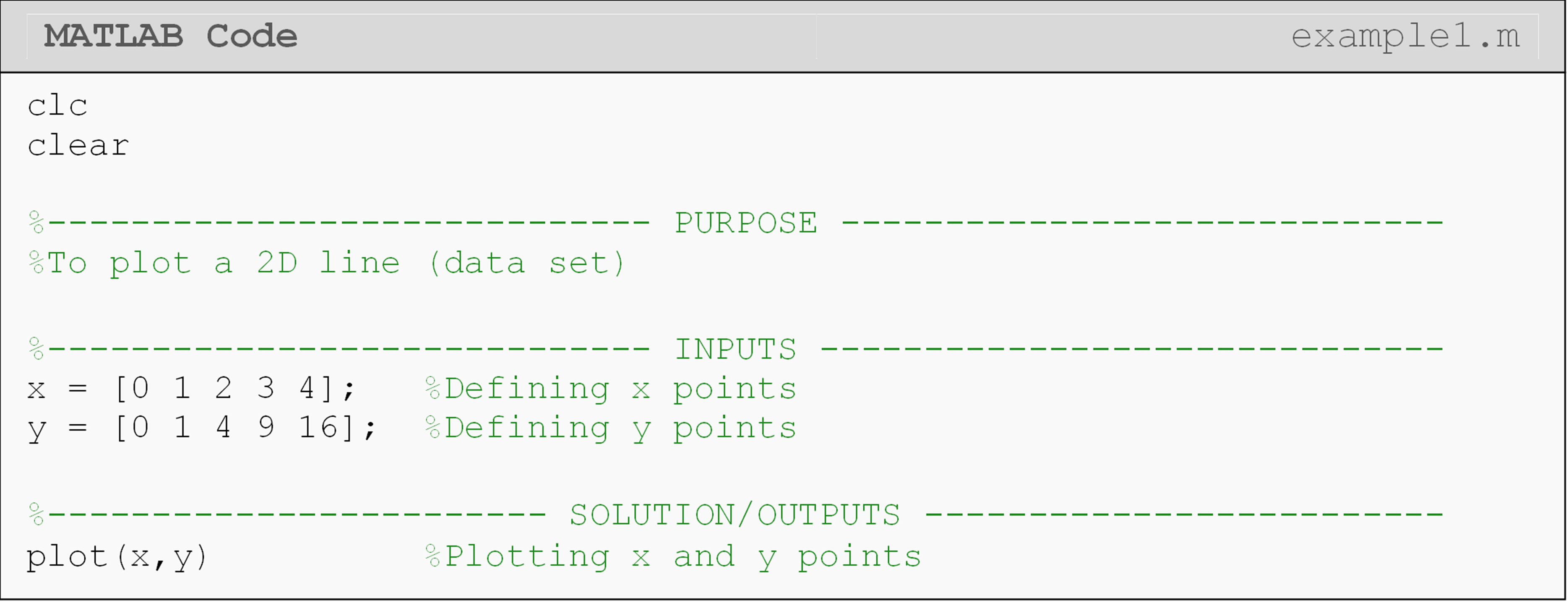
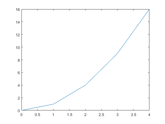
Figure 1: The figure output by the code in Example 1.
As discussed in Lesson 2.6, when inputting data points make sure you use
brackets to establish a vector and separate each data point with a
space. Note that we have turned the data pairs into two vectors. The
names of these two vectors do not have to be x and y as they can be
named as any legal variable names. Also, note that the plot simply joins
the given data points with straight lines.
How do I plot a function in MATLAB?
When MATLAB is plotting a function, the procedure is basically doing the
same thing as when plotting discrete points as shown in Example 1. The
only difference is in the creation of the points that we want to plot.
For a continuous function, we use the values from an x vector to build
the y vector by plugging individual values of x into the desired
function. When developing the domain of x values, the interval is
the space between each point. The smaller the interval, the resolution
of the plot and the computational time to create the plot both increase.
Example 2
Plot the given function using MATLAB plotting functions. To generate the y values from the function, use \(x\) values from 0 to 4 with an interval between each point of 0.1.
Function: \(\text{y}\ = \ \text{2}\text{x} + \text{1}\)
Solution
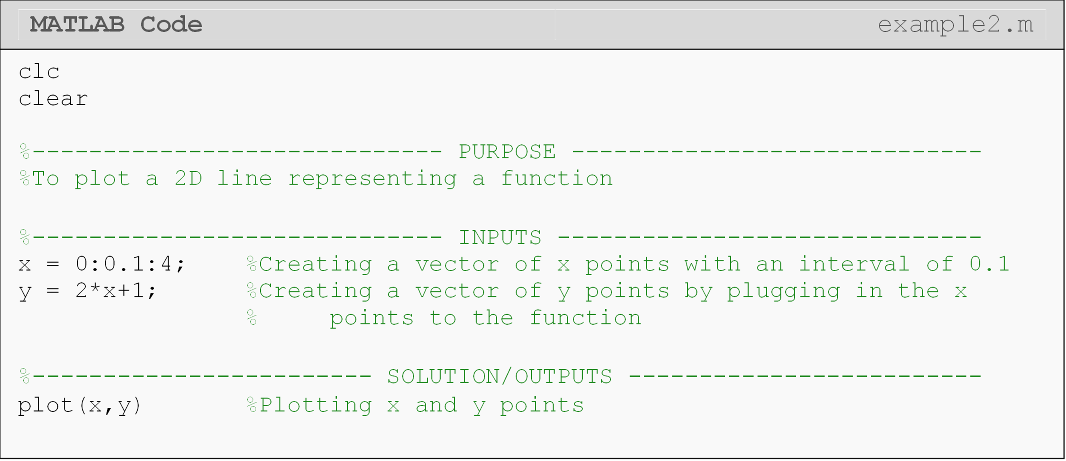
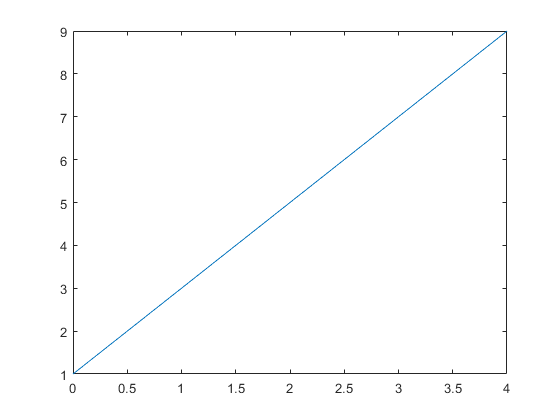
Figure 2: The figure output by the code in Example 2.
When generating the x vector, you should take note at the notation used (\(\text{x}_{\text{1}}\) (first data point): interval: \(\text{x}_{\text{n}}\) (last data point)). Having a colon (:) to separate the starting point, the interval, and the final point is not just used when plotting, it is also used when generating vectors in MATLAB. You can see this in Example 1, and we will use this notation again soon.
What is the difference between a figure and a plot?
A “figure” is the window containing a “plot”. A plot is a specific graphic that is displayed in the figure. You can see they are called separately in Example 1 where we first open a figure and then print a plot to it. Therefore, a figure can exist without a plot, but not vice versa (see Figure 3).
Figure 3: A blank MATLAB figure.
How can I enter nonlinear functions for plotting?
Many nonlinear functions that you want to plot will require the use of
an array operator. An array operator simply means you must use the dot
(.) character before the mathematical operator (e.g., A.*B). We
will deliberately shorten our explanation of this operator for now. Just
know that it comes from linear algebra rules, which we will cover in
detail in Lesson 4.6.
To makes things simpler for this lesson, we provide specific guidelines for when to use an array operator in this lesson. Although the following guidelines are not true in general, they are true for the examples and exercises seen in this lesson. They are also generally true when plotting, although you should carefully review the detailed explanations in Lesson 4.6.
Use an array operator when:
two vectors are multiplied together. Example:
vecA.*vecBa vector is in the denominator. Example:
2./veca vector is raised to a power. Example:
vec.^2
Do not use an array operator when:
a vector is an input for trig or log functions. Example:
sin(vec)a vector is multiplied by a scalar. Example:
2*vec
What are some possible errors with plotting?
While plotting, the following error message may pop up in the Command
Window:
Error using plot
Vectors must be the same length.
This error occurs because MATLAB needs to have the same number of elements in both the x and y vectors to develop a plot. This is also true of all 2D plots in general. You can use the length() function to quickly check the lengths of the vectors you are trying to plot.
Another common error:
Error using *
Inner matrix dimensions must agree.
The cause of this error often lies in not using the array (.) operator when plotting nonlinear functions. Make sure you follow the guidelines outlined above.
You may also have this error appear:
Undefined function or variable...
If this message appears, most likely you have not been consistent in your naming of your variables. Make sure that your vector names correspond to the plot() function inputs; remember that MATLAB syntax (functions and variables) is case sensitive.
How do I show multiple data sets on the same plot?
Often, you will want to put more than one plot on the same figure. The
command hold on can be used when you want to make multiple plots on
the same figure. It should always be placed right after the first
plotting function. In Example 3, you can see two plot() functions are
used along with the hold on. Because the plot() function is used
twice, MATLAB would “normally” default to generating two figures;
however, using the hold command tells MATLAB to place these two sets
of data on the same figure. The hold off is used when you have
completed all the plotting calls for that figure. You can place as many
data sets on the same figure as you want. Just make a new plot()
function for each new data set. Finally, note that hold can be used
with most other plotting functions: not just plot().
Example 3
Plot the given data pairs and the function on the same plot using MATLAB plotting functions. To generate the y values from the function, use \(x\) values from 0 to 4 with an interval between each point of 0.1.
Data Pairs: (0, 0), (1, 1), (2, 4), (3, 9), (4, 16)
Function: \(\text{y}\ = \ \text{2}\text{x} + \text{1}\)
Solution
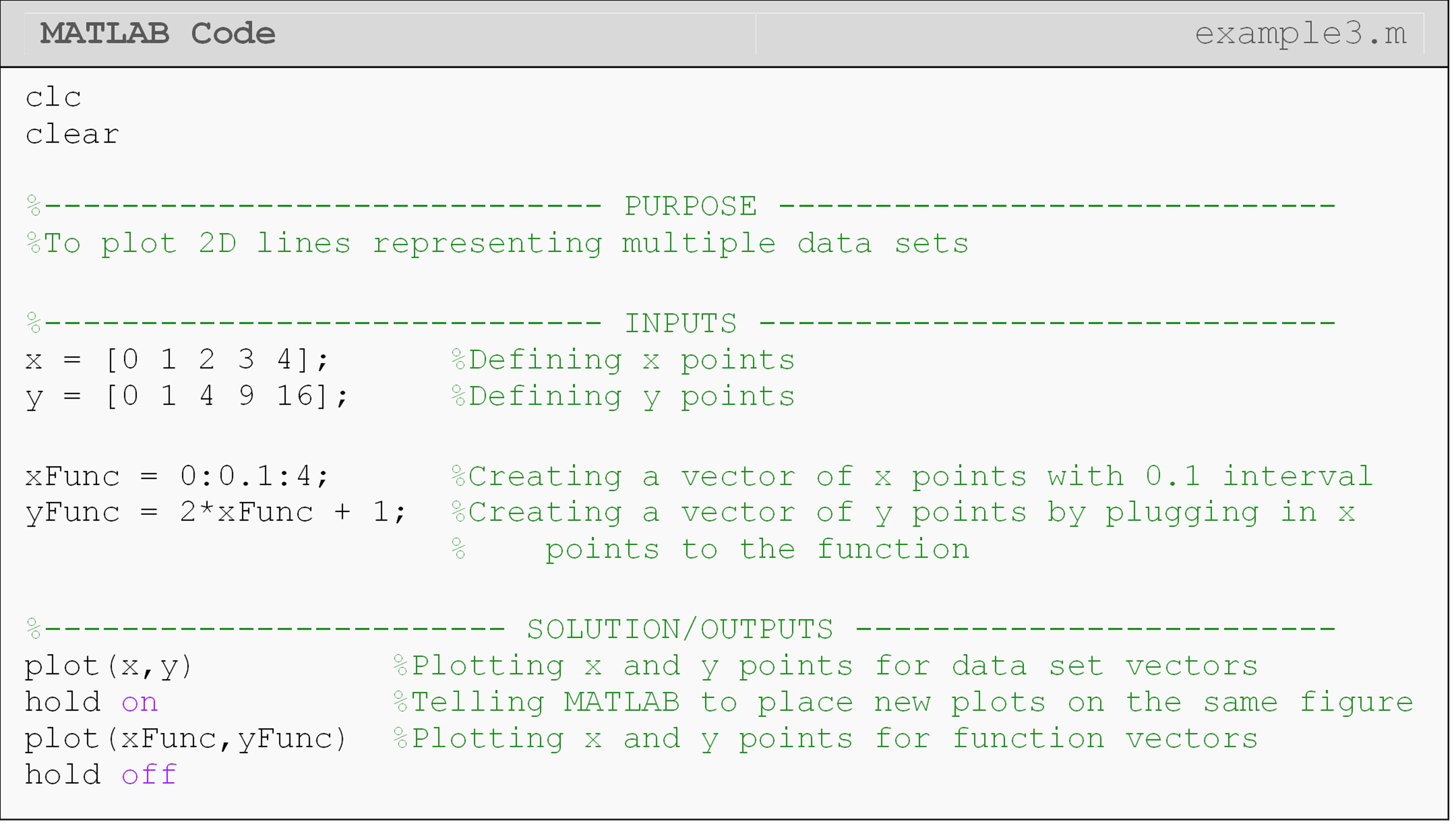
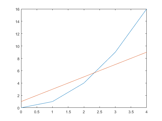
Figure 4: The figure output by the code in Example 3.
What are some other types of plots that MATLAB can generate?
An entire course can be devoted to making plots in MATLAB. Many different parameters can be controlled, animated, and viewed in different dimensions. Also, contours can be added, and labels and highlights can be placed in the graph. In this section, we cover one area of this extensive topic: the log-log and semi-log plots.
The loglog plot has a log-scale on both the x- and y-axis.
Function: Creating a log-log plot
loglog()
Function Inputs:
Domain of x values (vector), x Values of y at x values generated
using the function, y
Example Usage:
loglog(x,y)
A semi-log plot is different from the log-log plot because it has a log-scale on only on one of its axes; its x or y axis.
Function: Creating a semi-log plot
semilogx() or semilogy()
Function Inputs:
Domain of x values (vector), x
Values of y at x values generated using a function of x, y
Example Usage:
semilogx(x,y) or semilogy(x,y)
Example 4
Develop a linear-log plot with the logarithmic axis being the horizontal
axis. The function to plot is \(y\ = \ log(x)\). Note the MATLAB function
for this is log(). Use the function provided and a range of
independent values going from 1 to 3000 with an interval of 0.1. Be sure
to suppress the vertical and horizontal vectors as they contain
thousands of elements.
Solution
One can see that the semilogx() function is used to create a log-scale
on the horizontal or \(x\) axis of the figure.
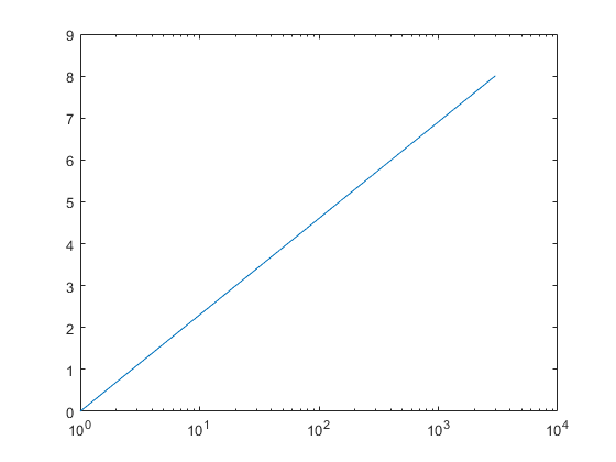
Figure 5: The figure output by the code in Example 4. Notice the x-axis is logarithmic.
How do I plot on more than one figure in the same m-file?
You have probably noticed that if you try to plot more than one figure
using the same m-file, only the last figure appears; that is, MATLAB
overwrites the preceding figures. The solution to this problem is
simple: use the figure command.
To number a figure, place the command prior to the plot function. For
example, to plot two different graphs, one would type,
figure
plot(x,y)
…
figure
plot(xp,yp)
MATLAB will open a new figure window each time the figure command is
executed. To display different figures in one window, the function
subplot() is used (This function is not discussed in the book. You can
search MATLAB help for subplot() to learn more about this function).
What is the close command?
The close command allows one to close one or more open MATLAB windows.
The close all command will close all open figure windows. This will
close all MATLAB figure windows that are open when it executes. If one
has numbered the figures in their m-file, MATLAB will continue to add to
the figures during each run of the m-file. This is similar to how the
Command Window will continue to display the output(s) from all previous
runs if the clc command is not used. This can become very cumbersome,
so it is usually a good idea to place this command at the beginning of
your program (following the clc and clear commands). Another option
to clear figures is the clf command, which stands for clear all
figures. The difference here is that it will clear the figure
windows, but it will not close the windows.
Lesson Summary of New Syntax and Programming Tools
| Task | Syntax | Example Usage |
| Open a new blank MATLAB figure window | figure |
figure |
| Plot 2D data points on linear axes | plot() |
plot(x,y) |
| Plot 2D data points on logarithmic axes | loglog() |
loglog(x,y) |
| Plot 2D data points w/logarithmic x-axis | semilogx() |
semilogx(x,y) |
| Plot 2D data points w/logarithmic y-axis | semilogy() |
semilogy(x,y) |
| Close all open MATLAB figure windows | close |
close all |
Multiple Choice Quiz
(1). The MATLAB function to make a plot is
(a) figure()
(b) fig()
(c) plot()
(d) pplot()
(2). The standard input form for the MATLAB function semilogx() for
plotting y vs. x data is
(a) semilogx(log(x),y)
(b) semilogx(x,y)
(c) semilogx(log(x),log(y))
(d) semilogx(x,log(y))
(3). The interval between the points in the array xx = 3:0.1:20 is
(a) 0.1
(b) 3
(c) 10
(d) 20
(4). To plot y=2x from x=3 to 7, the code would be
(a) x = 3:0.1:7;
y = 2*x;
plot(x,y)
(b) x = 3:0.1:7;
y = 2*x;
plot(y,x)
(c) x = 7:0.1:3;
y = x*x;
plot(x,y)
(d) x = 7:-0.1:3;
y = 2*x;
plot(y,x)
(5). The vector xp = 3:0.5:9 yields ________ elements?
(a) 6
(b) 7
(c) 12
(d) 13
Problem Set
(1). For the duration of one year, the total sales profit for a turbine company is recorded. At the end of each month, the total profit (in millions of dollars) for that month is calculated and stored in MATLAB as a vector, profit.
\[\ \text{profit} = \lbrack 0.3\ \ 0.45\ \ 2.1\ \ 1.4\ \ 1.12\ \ 3.2\ \ 2.3\ \ 1.23\ \ 0.76\ \ 0.97\ \ 1.2\ \ 0.78\rbrack\]
Using MATLAB graphing features, plot the profit vs. time (months).
Also, using the fprintf() function, output the total profit (in
millions) for the year.
(2). Plot the given discrete data set (as green points) and function (as a blue dash-dot line) on the same plot. Use the minimum and maximum of the x values in the discrete data set as the plotted domain of the function with an interval of 0.2.
Data points: (2.2, 6.4), (2.8, 11), (3.0, 13), (5.0, 35), (6.1, 51),
(8.0, 83)
Function: \(\text{y} = \text{5}\text{x} - \text{3}\)
(3). A rocket is horizontally strapped to the top of a sled and ignited. The position of this contraption is given as a function of time (sec) by
\[s(t) = \frac{3}{50}t^{3} + \frac{7}{30}t^{2} - 5t\ \ \left( \text{ft} \right)\]
Plot the position of the sled in MATLAB from 0 to 60 sec. Remember to follow the guidelines given in this lesson for raising a vector to a power when plotting.
(4). The kinetic energy of a system can be modeled as
\(\text{KE} = \frac{\text{1}}{\text{2}}m\left| v^{\text{2}} \right|\),
where
KE is the kinetic energy (\(N\cdot m\))
m is the system mass (\(kg\))
v is the velocity (\(\frac{m}{s}\))
Plot the kinetic energy of a system vs. velocity in MATLAB. Use values of mass as 2 kg and take the range of velocity as 0 to 30 m/s. Remember to follow the guidelines given in this lesson for raising a vector to a power when plotting.
(5). The velocity of a rocket is given by,
\(v(t) = 2000\ln\left\lbrack \frac{14 \times 10^{4}}{14 \times 10^{4} - 2100t} \right\rbrack - 9.8t,\ \ 0 \leq t \leq 30\)
where v is given in m/s and t is given in seconds. Plot the velocity
of the rocket as a function of time from 0 to 30 seconds. Use a loglog
plot. The function for finding a natural log is log() (see Lesson 4.1 or
use MATLAB documentation). Remember to follow the guidelines given in
this lesson for a vector in the denominator when plotting.